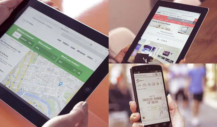
One set of content, different layouts
A responsive website uses the same URL and HTML while CSS adapts the presentation to the available space. Three desktop cards can become a single column on a phone. Content need not disappear, but its order should remain logical when items no longer sit next to each other.
Choose breakpoints around content
Change the layout when navigation, text or controls no longer fit, not just at the sizes of popular phones. Flexible widths and grids handle part of the work; media queries introduce changes at selected widths. The MDN responsive design guide explains this approach.
Example: our homepage image
This website's desktop desk photograph contains objects near both edges. A narrower mobile crop keeps the laptop, pencil and notebook visible near the centre. The photograph's crop changes, not the heading or offer. A version intended for that width loads instead of always sending the full desktop image to a phone.
Images should not shift the content
Reserve space with dimensions or an aspect ratio. Distinguish a decorative background that can be cropped from a product photograph whose details must remain visible. Review both orientations: a crop that works on a narrow phone may not work on a tablet.
Test more than window width
- Long headings and real translations, not only short placeholder text.
- Navigation, tables, galleries and forms with visible errors.
- Enlarged text, keyboard focus and reading order.
- Slow image loading and button positions before and after loading.
- A real phone, touch interaction and an open keyboard.
A responsive layout does not guarantee search rankings. It should provide usable access to the same helpful content. Review our responsive web design service and actual CMS examples.
Planning a similar project?
If you want to apply this advice to your business website, review the related services or send a short inquiry so we can estimate the scope.